Table of Contents
1. Introduction
2. The Rebranding Journey of Zendesk
3. Love Your Helpdesk: A Unique Approach
4. The Original Brand and Its Evolution
5. The Need for Change: Moving Beyond the Buddha
6. Design Battles and the Quest for Authenticity
7. Redefining Relationships through Design
8. The Power of Simplicity and Symbolism
9. Embracing Change and New Possibilities
10. Conclusion
Introduction
In today's fast-paced digital world, customer support has become an integral part of every business. However, it is often seen as a tedious and frustrating experience. Zendesk, a software company founded in 2007, recognized this challenge and embarked on a rebranding journey to transform the perception of customer support. This article explores the fascinating story behind Zendesk's rebranding and the creative decisions that shaped its new identity.
The Rebranding Journey of Zendesk
Zendesk's rebranding journey began when its co-founders realized the opportunity to revolutionize the customer support industry. They wanted to take something traditionally perceived as boring and make it exciting and enjoyable. The chief creative officer, Ed, initially advised against the rebranding, but the team was determined to create a fresh and innovative image for Zendesk.
Love Your Helpdesk: A Unique Approach
To differentiate themselves from the competition, Zendesk adopted a unique approach called "Love Your Helpdesk." This concept aimed to change the way people think about customer support. Alexander, the designer of the original product, wanted to market it differently from the industry norm. The team introduced a lovable character, the Buddha, with a headset, rounded typefaces, and funky characters. The choice of a green color palette symbolized freshness and stood out in the customer service space.
The Original Brand and Its Evolution
Toka, the chief creative officer and the original brand designer, loved the uniqueness of the original Zendesk brand. However, as the company grew and expanded its product offerings, they realized the need for a more flexible and representative brand. The team felt nostalgic about the Buddha but struggled to deepen the brand story around it. They aimed to design a system that reflected their diverse range of products while maintaining a connection to their core mission.
The Need for Change: Moving Beyond the Buddha
Despite the success of the original brand, the team grew tired of the Buddha's limitations. They wanted a brand that could evolve and adapt to their expanding product line. Erin, the director, agreed with Bob, the creative director, that the brand needed a change to better represent the company's values and offerings. They sought a brand that could tell a deeper story and resonate with their customers on a more profound level.
Design Battles and the Quest for Authenticity
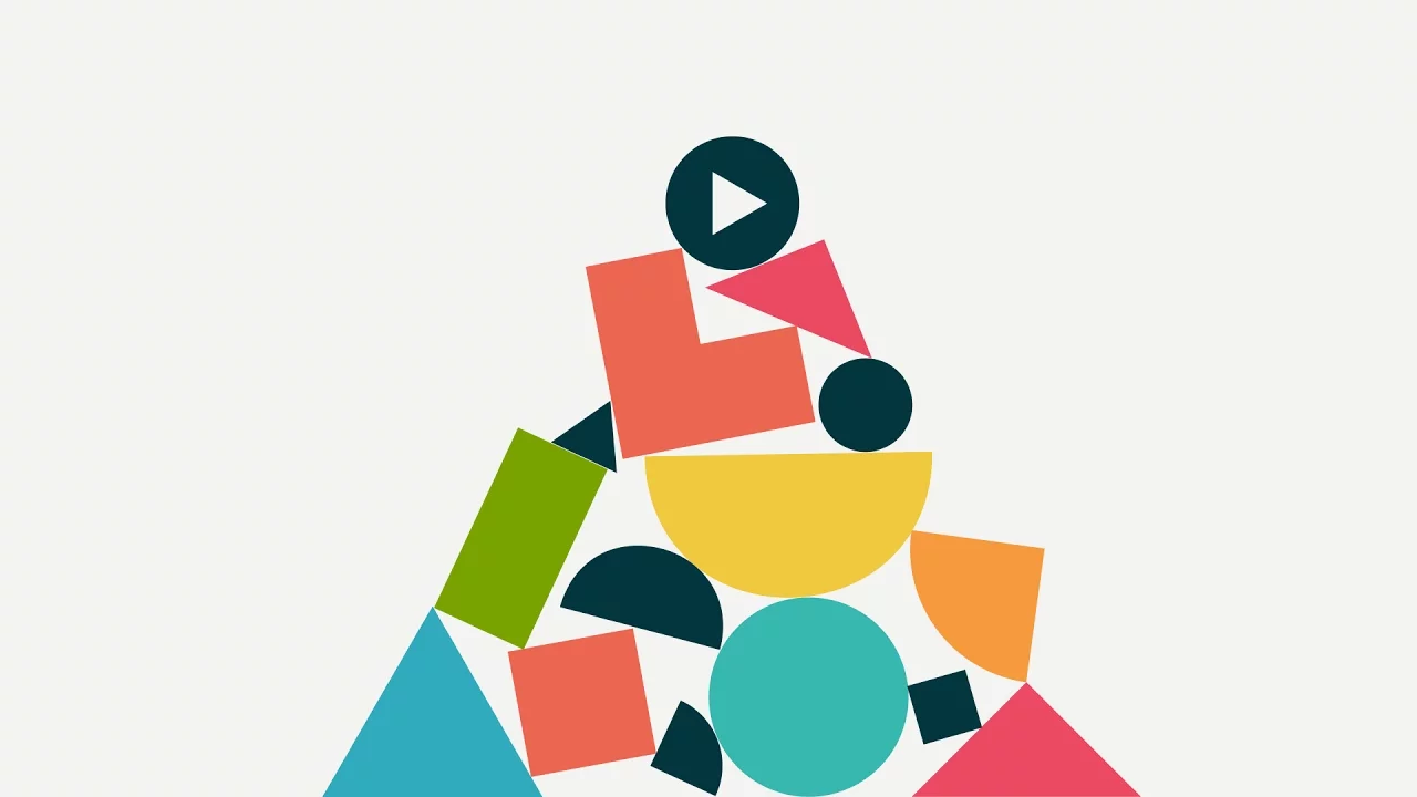
The rebranding process involved numerous design battles and discussions. The team aimed to communicate the essence of their products and the complex relationships they fostered. They wanted a design that was abstract yet relatable, simple yet powerful. Color played a crucial role in the rebranding, with various ideas and suggestions being considered. Ultimately, they settled on two shapes leaning on each other, symbolizing support and relationships.
Redefining Relationships through Design
The new Zendesk brand aimed to capture the essence of relationships and conversations. The design portrayed the relationships between customers and support agents, showcasing them in the middle of a conversation. This dynamic approach allowed for animation and storytelling, making the brand come alive. The team believed that the new design set the stage for exciting possibilities and a fresh start.
The Power of Simplicity and Symbolism
Simplicity became a guiding principle in the rebranding process. The team wanted a design that was strong, memorable, and timeless. They sought to avoid generic logos that lacked history or authenticity. By embracing simplicity, Zendesk's new brand stood out among the cluttered landscape of logos. The chosen design conveyed a sense of strength and stability, reflecting the company's commitment to providing reliable customer support.
Embracing Change and New Possibilities
While change can be daunting, Zendesk embraced it wholeheartedly. The new brand opened up a world of possibilities for the company. It allowed them to move beyond the limitations of the Buddha and explore new avenues for growth and innovation. The flexibility of the new design presented both opportunities and challenges, but the team was excited about the potential it offered.
Conclusion
Zendesk's rebranding journey exemplifies the power of design in transforming perceptions and creating meaningful connections. By moving beyond the familiar and embracing change, Zendesk reinvented itself and positioned its brand for future success. The new design reflects the company's commitment to providing exceptional customer support and sets the stage for continued innovation and growth.
---
**Highlights:**
- Zendesk's rebranding journey transformed the perception of customer support.
- The "Love Your Helpdesk" approach aimed to make customer support enjoyable.
- The original brand featured the Buddha, but the team felt the need for a more flexible design.
- Design battles led to a simple yet powerful brand symbolizing relationships.
- The new design captures the essence of conversations and opens up new possibilities for Zendesk.
---
**FAQ:**
**Q: Why did Zendesk decide to rebrand?**
A: Zendesk recognized the opportunity to revolutionize the customer support industry and wanted to create a fresh and innovative image for their brand.
**Q: What was the inspiration behind the original Zendesk brand?**
A: The original brand featured the Buddha, rounded typefaces, and a green color palette, symbolizing freshness and uniqueness in the customer service space.
**Q: How did Zendesk approach the rebranding process?**
A: The team engaged in design battles and discussions to create a brand that could tell a deeper story and resonate with customers. They aimed for simplicity, symbolism, and authenticity.
**Q: What does the new Zendesk brand symbolize?**
A: The new brand symbolizes relationships and conversations, portraying customers and support agents in the middle of a conversation. It aims to capture the essence of the support experience.
**Q: How does the new Zendesk brand open up new possibilities?**
A: The new design allows Zendesk to move beyond the limitations of the original brand and explore new avenues for growth and innovation in the customer support industry.
---
Resources:
- [Zendesk Rebranding](https://www.zendesk.com/rebrand/)
- [AI Chatbot Product](https://www.voc.ai/product/ai-chatbot)

